Tuesday 21 June 2011

Assignment 3: Colour: Still Life: Colour Harmony – Similar Colours

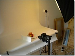
For this still life I have chosen the warm colours of ripe fruit to show colour harmony with similar colours.(adjoining colours between red and yellow on the colour wheel)  Once again I have used a macro lens to frame the fruit closely. The set is as shown below. I have used just one soft box at 45° to the right and polystyrene reflectors to lift the shadows.

DSCN1266_web

6601: 1/125s f13 80mm macro lens


Colour Diagram - Notes: I have oversimplified the tones here. Warm colours dominate the frame, the two cherries were chosen for their different tones of red and the graduation of yellows through to orange and pink/red on the apricots and peaches, help to reinforce the colour harmony in the image. For this and the previous assignment picture, I have set the picture control on my camera to Vivid to ensure saturated colours. Once again there are points, at least one, possibly two triangles to give movement to the image.

Monday 20 June 2011

Assignment 3: Colour: Still Life: Colour Harmony – Complimentary Colours

 The assignment brief is to take four photographs to show each of the following in deliberate relationships:
  • Colour harmony through complimentary colours
  • Colour harmony through similar colours
  • Colour contrast through contrasting colours
  • Colour accent through any of the above
I will attempt to include the following categories in each of the groups above:
  • Abstract
  • Landscape (nature)
  • Cityscape (man made)
  • Still life (including food)
I have given this assignment a lot of thought and planning. I am starting by taking the still life photographs.

Still Life: Colour Harmony – Complimentary Colours

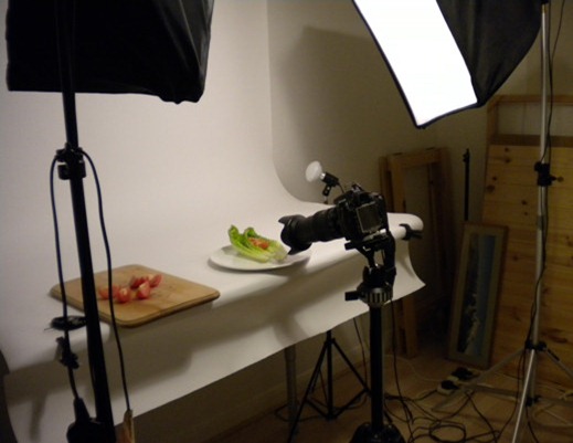
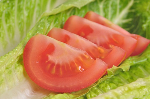
I have started with a simple close up image of tomato segments and lettuce for complimentary colours in proportion to their relative brightness i.e.1:1. The photo was taken in my studio setup using just one soft box to the right as shown below:

DSCN1265

6547: 1/125s f13 80mm macro lens

DSC_6547_edit01_web


colour_diagram01
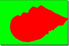
Colour Diagram – notes. This image’s colours are fairly well balanced, they are in the correct proportion according to their relative brightness (1:1). The red is not fully saturated and does not overpower the green. The elements in the composition include both curves and diagonal lines introducing rhythm across the frame.

Friday 10 June 2011

Project: Colour Relationships Tones in Black and White

Exercise: Colours into tones in black and white.

Objective: To demonstrate the effects of using coloured filters with black and white images. This will be achieved digitally by carrying out a black and white conversion of a coloured image and applying red, yellow blue and green filters digitally using imaging software. There is a 18% grey card included in the image (bottom left corner) to ensure that the exposure is neutral.

Original Image: 6495 1/125s f22 60mm softboxes left and right at 45º


Straight B&W conversion. I don't have a  version of photoshop which includes a straight forward B&W conversion. I used Capture NX2 which has two sliders; a filter hue calibrated in ° of the colour circle and a filter strength slider calibrated in %. I have shown the effect and the slider positions above each image. I was unable to reduce the effect of colours other than the selected one. To show any appreciable differentiation, each filter effect needed to be full strength. 
Default: Hue 60° strength 40%  (the application uses these settings on applying Black and white conversion.)


Yellow: 60° Strength 100%


Red: 360° Strength 100%


Blue:240° Strength 100%


Green: 90° Strength 100%


Conclusion
The effects of the filters can be clearly seen here although there are some differences in the tones compared to the examples in the course book. It would be interesting to know which method, film or digital, was used to produce those images. The most striking difference is with the blue filter. The Wratten 47 has rendered the blue to white, whereas in the example above, the blue is at its lightest but nowhere near white. It is also interesting to note that the 18% grey card has remained consistent in its tone throughtout.

Monday 6 June 2011

Project: Colour Relationships

Exercise: Colour Relationships

Objective:
1. To produce 3 photographs illustrating each of the complementary pairs of colours in the proportions: orange:blue 1:2, red:green 1:1, yellow violet 1:3.
2. To produce 3 or 4 photographs of colour combinations (two or more colours) that appeal to you, making notes about the effects of any imbalance.

For two photographs for part 1, I have used what I found indoors:

Orange:Blue
6392: 1/125s f13 200mm, studio flash, 60cm softbox 45º right


Yellow:Violet
6417: 1/125s 5.6 34mm


Section of a stained glass window in Portsmouth's Royal Garrison Church. I accept that this may be stretching the amount of violet but other than african violets or pansies this was the best I could find. I'll add another example if I find one.

Red:Green
6394: 1/125s f13 29mm, studio flash, 60cm softbox 45º right


Part 2

6430: 1/750s f5.6 200mm


I'm not sure how well my colour sense is developed. I don't seem to have any notion of colour clashes. I find a mixture of primary colours attractive as in this colourful crowd of canoeists on  the Basingstoke Canal. All of the primary and secondary colours are here with the exception of the elusive violet. The overall green tone of the background and foreground mean that the warm primaries red and yellow really jump out. Visually, the tension seems to be to the left where the brighter tones are.

6413: 1/750s f5.6 200mm


The warm colours  still give some tension in this image. If orange has a relative brightness of 8 compared to 6 for red and there is approximately only half the area of red flowers then there is again some movement towards  the left in terms of colour.

6428: 1/125s f13 200mm back lit  white paper with wide angle flash.


This has blue and its complementary orange with a second complementary, green. I find green and orange attractive with blue. In terms of warmth, the orange adds some balance to the cool of the blue and green.

6463: 1/350s f9.5 55mm


Colour accent is shown here with the cyclist's red T shirt against the predominant green tones of the scene.

6484: 1/125s f19 80mm macro lens


Orange red and green go well together, especially in food as shown by this colourful fruit salad.

What did I learn from the exercise? Both of the exercises so far in this section have made me aware of the role of the primary colours and their secondaries, their relative brightness and the ideal proportions in which the primary and its seconday appear to balance. With regard to colour clashes, I think I need to experiment more with different combinations of colours to see what works and what doesn't. I suspect that I will find that it will be the secondary and tertiary hues that cause the greatest inbalances.